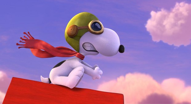
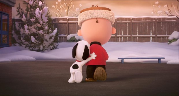
Animation supervisor Nick Bruno, art director Nash Dunnigan, lead color designer Vincent Nguyen, lighting supervisor Jeeyun Sung Chisolm and colorist Natasha Leonnet discuss the challenges of bringing Charles Shulz’s iconic characters to life in the latest CG-animated feature from Blue Sky Studios.
Director Steve Martino and the entire Blue Sky team had been enchanted from an early age by Charles Shulz’s comics, TV specials and movies but when the property came to Blue Sky over three years ago, nobody really knew yet how Schulz’s very 2D world would translate to 3D CG. The characters’ proportions have very little to do with those of real humans, or really any object that exists in real, 3D space. And their iconic movements were determined by Schulz’s vision and by the production vicissitudes of cell animation (the Peanuts animation, most of which was directed by Disney veteran Bill Melendez, was shot on twos).
Animation supervisor Nick Bruno recalls the initial discussions with Martino, when they would just sketch ideas, initially on pencil and paper, and later in Photoshop. Martino worked with Schulz’s son Craig and grandson Bryan, who co-wrote the film with Cornelius Uliano as everyone involved brainstormed about the issues involved in bringing 2015 technology to the world of Peanuts.
“There were a lot of different opinions on how to tackle this thing,” Bruno recalls. “You’ve seen adaptations of 2D properties done with human eyes and realistic proportions and realistic fur and details. We had a camp that said, ‘We’re doing it 3D, we’re a CG company.’“
Let’s put the discussion in context. Bruno’s earliest understanding of animation came about in childhood from a hand-cranked Fisher-Price movie viewer that he used to watch a clip of Snoopy and the Red Baron hundreds, maybe thousands of times. When his father heard he’d be working on the Peanuts film, his one piece of paternal advice was, “Don’t screw it up!” And when Bruno recalls tests of the characters during the look dook-dev process, that didn’t quite hit the mark, he doesn’t say the results were “almost there,” he repeatedly refers to unsuccessful iterations of Charlie Brown, Snoopy and the rest of the characters as “horrifying.”“If your best friend walks through the door looking and acting different,” he says, “It doesn’t feel like the same person.” Making sure these were the same people that generations loved was the first order of business. Martino, the Schulzes and Paige Braddock (one of the only artists Charles Schulz ever authorized to draw his characters), offered significant input.
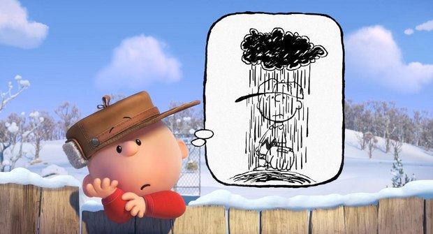
That said, this look-dev phase was a time for even those closest to the characters to experiment. A suggestion from Craig Schulz that Charlie Brown’s bald head was sketched to represent what was actually a close-cropped crew cut led to some of those sketches Bruno referred to as horrifying. As did those with characters having more lifelike eyes, rather than the ink pools, which the team refer to as “periwinkles.” “When we did tests with more three-dimensional characters,” Bruno shudders, “they were just horrifying!”
Likewise, the TV specials and movies were all shot on twos -- a common practice in traditional animation that CG and procedural animation rendered unnecessary. It’s not a look the current generation would expect to see in a movie from a Blue Sky or a Pixar. But Bruno reports that the early animatics generated in Maya, with movements on ones, was…you know. “It just didn’t look right,” he says. “It wasn’t until we completely broke our pipeline to make it look like the strip or the specials that we all started to say, ‘OK, now we’ve got something.’“Bruno elaborates: “One of the benefits of a computer is that it calculates things for you. If I rotate a character’s arm 90 degrees from zero, the computer can calculate how it moves and it can generate motion blur and cloth simulation so the clothes follow the arm movement in a natural way. But once you start doing things on twos, once you treat it like a cartoon and turn one arm off and another one on, the computer doesn’t know what to do. So we’re using 3D parts but animating them in a 2D way, sculpting every single frame.”
“It took a lot of R&D to get it to look correct,” says The Peanuts Movie art director Nash Dunnigan, who also came onboard at these early stages. Dunnigan, whose earliest childhood drawings were of Snoopy, Woodstock and Charlie Brown, had as strong a sense as any on the team for what did and did not feel like the Peanuts characters. Snoopy, for example, “is a Picasso,” he says. “The side view and front view were drawn with the exact same silhouette but in the side view both eyes migrate to the same side of his head.” This, he notes, is not the type of representation that sits well with software designed to represent real world physics.“Even our [virtual] camera choices and the posing had to be adapted,” Dunnigan adds. “You only see Charlie Brown and Snoopy’s heads posed in a few iconic positions. There’s the three-quarter view, the front view, the side view, and occasionally looking up or down. And we had to use really long lenses -- 50mm and above, especially in Charlie Brown’s world because the characters’ heads are so round that with a wider lens, they looked really distorted. And in order to work with such long lenses, we had to build all our sets three times as deep as we would otherwise so we could get the camera far enough away to shoot with such long lenses. It wasn’t a normal choice for 3D animation.”
The production used Autodesk Maya for animation and Blue Sky’s proprietary CGI Studio for all rendering, but many elements still had to be animated using more traditional methods. “We developed simulations so clothing on characters would obey the laws of physics and gravity and play well on splines in Maya,” Dunnigan explains, “but that doesn’t work when you’re animating on twos. If you tried to run it through a cloth simulation, all sorts of wacky things happened so all the clothing had to be hand-animated.“We have all these cutting-edge tools including the renderer with all this fire power to throw at [the work] but in the end we have this fully lit, sculptural environment but you’ve got all this animation on twos. The result is a nice hybrid but it wasn’t like anything we’d ever done before.”
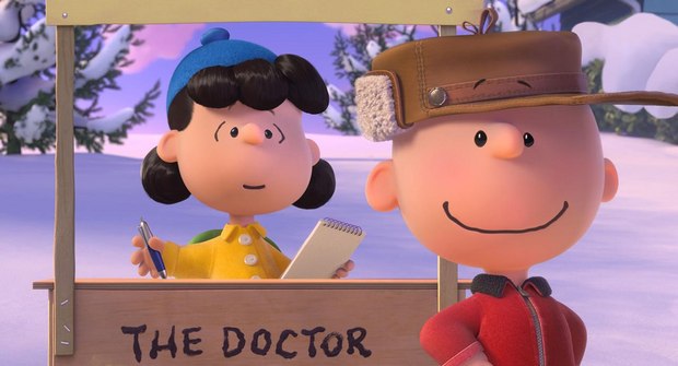
Vincent Nguyen, lifelong Peanuts fan and lead color designer on the movie, explains that his experiments suggested that he needed to be quite subtle for Charlie Brown’s world, although he could push further with Snoopy’s Red Baron imaginings. “We couldn’t ever dramatically light the character,” he says. “We always had to make sure the signature color pallet was reading well so there was a softness to the look. There is some more dramatic lighting in the Snoopy world but in the kids environment there’s a softness to the lighting that we really couldn’t change. It was always about making sure that their facial features read the way you expect in Peanuts.”
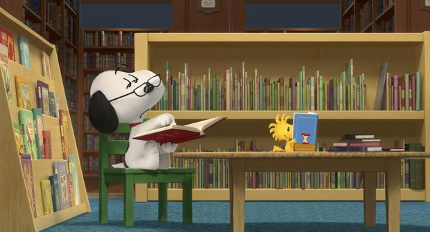
Lighting supervisor Jeeyun Sung Chisolm, who recalls that her nickname growing up in Seoul, Korea was Snoopy, discusses her approach to lighting, which was significantly less reality-based than her previous work at the studio. “When we’re working on Rio,” she says of the blue feathered bird “we have dynamic moving cameras everywhere and we can have lighting that’s maybe a little bluer or more yellow and everything is more forgiving. Snoopy is white. The brightest white on Snoopy is pure white but the darkest point of Snoopy is still light gray so that doesn’t give us much of a range to work with if we want to use light to make him appear more dimensional.”She developed a specific lighting scenario for each character. “Charlie Brown and the other [children] have perfectly spherical heads,” she observes, “but you notice in the center area where you see their facial expressions, the eyes, nose and mouth are slightly brighter. So we added a little spotlight to the character rigs so we could use for the rest of the movie.”
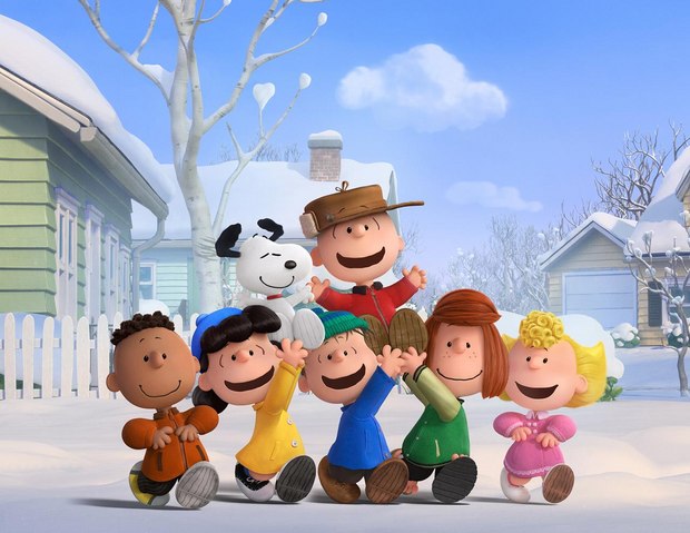
This light, she explains in cinematography terms, is partially “motivated” by light sources in the scene, but not entirely. “It is and it is not coming from somewhere,” she says. “We have an original look for every scenario. Take the dancing scene with Charlie Brown and the other kids. Their lighting comes mostly from the internal rig but if they’re walking outside of school under sunlight, we can give them a different range of color and values but it’s still all within the world of the comic.”
Final color grading was done at EFILM in Hollywood by Natasha Leonnet, who says she loved Snoopy “to an extreme! And everybody else in the room felt the same way.” She worked in Autodesk Lustre to grade first the 2D version and then the 3D 6- foot-lambert and 3D 3.5 foot-lambert versions. “It was always about retaining the look of the Sunday comics,” she notes. “Even in the 3D, that was always what we aimed for.”While Blue Sky did carefully and gingerly introduce some of the dimensionality it’s known for, doing so was always limited by the established iconic feel. “We wanted it to be like you’re looking at the Sunday comic,” says Bruno, “but you can also kind of stick your head inside and look around.”
To further play against all Blue Sky’s 3D firepower, Martino also made use of the 2D animation package, TV Paint, to draw visible lines into the shots. Martino, Bruno recalls, “loved a lot of those elements of the TV shows that have nothing to do with the real world, like when the kids decorate the Christmas tree by just waving their hands. That’s the kind of simplicity we embraced.”
--Jon Silberg is a Los Angeles-based writer who specializes in stories about film and television production and post.
