Renowned drawing instructor Glenn Vilppu offers the eleventh installment in his bi-monthly Animation World Magazine online drawing course. In this chapter, he discusses the utilization of direct lighting.

This is the eleventh in a series of articles on drawing for animation. In these articles I will be presenting the theory and practice of drawing as a "how to" instructional series. The lessons are based upon the Vilppu Drawing Manual and will in general follow the basic plan outlined in the manual. This is the same material that I base my seminars and lectures on at the American Animation Institute, UCLA, and my lectures at Disney, Warner Bros. and other major studios in the animation industry, both in the U.S. and their affiliates overseas. If you have not seen the previous lessons starting in the June 1998 issue of Animation World Magazine, it is recommended that you do. The lessons are progressive and expand on basic ideas. It is suggested that you start from the beginning for a better understanding of my approach.

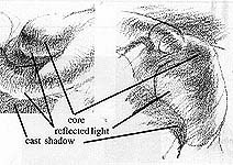
Illustration No. 1
Direct Lighting
In the last chapter, we discussed indirect lighting, the modeling tone, and started on atmospheric perspective, which we will be dealing with more in Chapter 12. Direct lighting is what we normally see when we have a strong single light source. Sunlight on a clear day is an example. The basic elements of direct lighting are highlights, halftone, core, reflected light, and cast shadow (see Illustration No.1). The luminosity of a drawing is affected by how the reflected light is surrounded by the core and the cast shadow. In thinking of the reflected light, each surface that the light reflects from is, in essence, a light source. In practice, it is generally a good idea to use only one reflected light and one direct light. It is important to always keep a clear distinction between the direct light and the reflected light.

All drawings in this article are by and © Glenn Vilppu.
"Try to visualize the forms as simple sylinders and spheres."

The core tone, which is created by the area between the direct light and reflected light that does not get any light, is a potent tool in describing how forms fit into one another. The core functions as a broad tonal line that helps delineate the form's surface with its changes in sharpness (describing the suddenness of change in the surface).
The core helps to emphasize the corners of the form. As you move the light sources, you will see how this core describes the form in conjunction with the reflected light.
The cast shadow works hand-in-hand with the core. The primary difference is that the cast shadow has a sharp edge and the core has a softer edge since the core is created by the turning of the form, while the cast shadow is created by forms blocking light from other forms. The cast shadow changes in relationship to how far it is from the object that is casting it. It is sharper and darker closest to the object and softer and less intense as it moves away from the object. It also functions as a line that describes the contour of the form.

Be careful that you don't give the core a sharp edge unless the form has a sharp edge. Conversely, keep the cast shadow sharp next to the form that is casting it, slowly softening it as it moves away from the source. Look at cast shadows as opportunities for making lines going over the form, describing the surface.

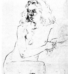
"Notice how the core clearly defines the corner of the form without being a straight line." The highlight should vary like the core, being broad when the form is broad and sharp when the form is sharp. The accent of the highlight can be used to show the pressure of a bone pushing to the surface, and the sharpness of a crease. It also becomes a useful tool in showing the bottom of a fold where the form changes direction. In the drawing to the left, the core and the edge of the cast shadow on the face have become the main elements of the drawing. The shadow side is completely left out, with the exception of minimal descriptive line. In the drawing below, notice how the core clearly defines the corner of the form without being a straight line.

The lines, in general, correspond to the surface describing the form. Notice the variation in the thickness of the core.
The simple basics of boxes and spheres is the foundation for developing clear tonal drawings. If you do not understand the three dimensional qualities of the form, you cannot successfully render the form in tone.

Glenn Vilppu teaches figure drawing at the American Animation Institute, the Masters program of the UCLA Animation Dept., Walt Disney Feature Animation and Warner Bros. Feature Animation, and is being sent to teach artists at Disney TV studios in Japan, Canada and the Philippines. Vilppu has also worked in the animation industry for 18 years as a layout, storyboard and presentation artist. His drawing manual and video tapes are being used worldwide as course materials for animation students. Glenn Vilppu first wrote for Animation World Magazine in the June 1997 issue, "Never Underestimate the Power of Life Drawing." His drawing manuals and video tapes may now be purchased in the Animation World Store.


