In the fourth Open Season production diary, Sony Pictures Animation chronicles how it approached consistency in character design and created special rigs.

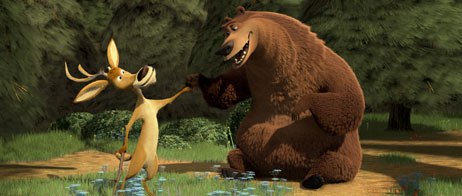
The directors of Open Season wanted more than just a classic buddy pairing between Boog and Elliot. They strived to develop a sandpaper relationship between them. All images © Sony Pictures Ent.
From the AWN/VFXWorld Exclusive Open Season Diaries.
It goes without saying that great characters are essential for a great story. The directors of Open Season wanted more than just a classic buddy pairing between the two leads. Boog and Elliot when it comes right down to it are in the same boat: they both want to belong and fit in. So neither, really, plays the lead or just the sidekick they both are sidekicks to each other. Directors Roger Allers, Jill Culton and Tony Stacchi went to great length to develop a sort of sandpaper relationship between Boog and Elliot. There is a constant grating between the two, the ultimately pays when they eventually do set aside their differences, work together and become great friends.
There are four main characters in Open Season: two animals, Boog, a 900-pound grizzly bear played by Martin Lawrence, Elliot, a scrawny mule deer played by Aston Kutcher; and two humans Beth (Debra Messing) who raised Boog, and Shaw (Gary Sinise), the villain. In addition, there are a number of secondary humans and animals including Sheriff Gordy (Gordon Tootoosis), a Scottish squirrel named McSquizzy (Billy Connolly) and his army; a herd of deer lead my alpha-male Ian (Patrick Warburton); the most beautiful doe in the forest, Giselle (Jane Krakowski); wise-guy construction workers led by a beaver named Reilly (Jon Favreau); mean talking skunks Rosie and Maria (Nikka Futterman and Michelle Murdocca); a domesticated dachshund named Mr. Weenie (Jurgen Gross); a misfit porcupine (Matt Taylor); a wacky tourist named Bobbie (Georgia Engle); scores of hunters; and lots of rabbits.
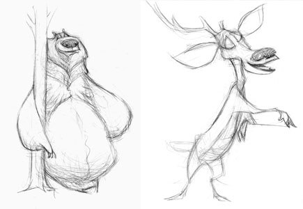
Just as the script starts with storyboarding, the same is true for the character designs.

Character designer Carter Goodrich created characters with exaggerated, iconic and simple shapes. Boog has a big belly and short legs while Elliot, a tiny deer with a large head on a long neck, is missing one antler.
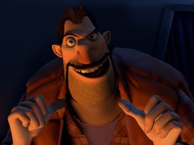
To ensure consistency between the look of each characters, the directors called upon artist Carter Goodrich, whose work is seen frequently on the cover of New Yorker, to serve as character designer. Goodrich set out to design characters with very exaggerated, iconic and simple shapes. Boog has a big belly and short legs. Elliot is a tiny deer with a large head on a long neck, and hes missing one antler. Reillys pelt makes him recognizable as a beaver, but he has a giant nose and a tiny mouth and eyes. Shaws shape was primarily defined by his vest; Beths by the bell shape of her pants and her hat.
They all needed special rigs. The secondary humans were derived from two shapes and rigs, one fat and one skinny. Whether fat or skinny, all the characters had simple silhouettes. The designs were sketchy and the final models were simple as well; even the heads were fairly low-resolution.
Further, it was important to keep simple, straight lines and not to confuse the shapes with complicated textures, materials and surfaces. If the characters were too detailed, they wouldnt fit the stylized world. At the same time, however, the crew didnt want the characters to appear so simple they looked cheap. This was especially challenging for the lead humans.

The look development team had to decide how much detail to give the humans. It created simplified texture maps in which the realism was toned down, bump values were lowered and detail was reduced.
The animals had fur that needed to look luscious, but deciding how much detail to give the humans was more difficult. At first, the faces had realistic hair, dirty fingernails, oily skin with hair follicles and glamorous eyelashes. The characters couldnt look photoreal, yet the skin needed some link to reality. Imageworks had created texture maps for digital doubles in many live-action films and the crew for Open Season drew on that experience, using specular color maps, specular bump maps, subsurface scattering and other lighting techniques to keep the skin from looking plastic and mole maps and dirt maps to add detail. However, for Open Season, the look development team had to create a simplified, more graphic representation of these maps. The realism was toned down, bump values were lowered and detail in the texture maps was reduced.
For the furry animals, the challenge was in creating correct contours that matched the designs even after animation. Boogs fur, for example, came to a chevron point in his chest, so special tools provided ways to maintain the correct lines based on poses from animation.
As in most CG features, eyes were the biggest issue. Initially, the directors wanted cartoony eyes without an iris, but the simple eyes didnt help sell the animation. Giving the hero characters color and texture in the iris helped them connect with the audience. To help style the eyes in a 2D way, though, the crew amped up the whites and made them brighter: slightly unrealistically bright.

As in most CG features, eyes were the biggest issue. Initially, the directors wanted cartoony eyes without an iris, but it didnt work. Instead the crew amped up the whites and made them slightly unrealistically bright.
All the secondary characters were derived from the main characters; the hunters were all derived from Bob and his wife Bobbie. They all had fewer controls and shapers but still had the same basic animation controls. As with the main characters, they had simple shapes with clean lines and a graphic feel.
Some sequences required crowds of characters derived from these archetypal shapes. The generic character library contained one generic über character per type: male, female, child male, child female, fat hunter, skinny hunter. Generic variations were then created in look development, which united different combinations of texture, clothing, hair patterns, to create 10-20 variations per generic character. These combinations were packaged into datasets and then, at render time, the datasets were associated with the über character. This allowed the directors to quickly pick and change variations for a large crowd of generic characters without going back to animation.
Turning any character from 2D to 3D always presents unique challenges. For character setup supervisor Mike Ford, meeting early on in the process with the directors and lead animators to discuss the style of animation they want for the film is crucial. The style of the animation really determines the technical problem solving specific challenges needs to be done. While the animators and directors spend time talking about what they want, Ford and his team spend most of their time focusing on the main stylistic principles that the directors desire. In the case of Open Season, Culton, Allers and Stacchi defined two distinct directions when it came to realizing the characters for 3D: 1) extreme squash-and-stretch capabilities in all of the rigs; and 2) defined contour and silhouettes to camera for every part of the character. (More on squash-and-stretch in our upcoming Animating the Animals installment.)
Of course, each character has to interact with objects in their environment. Props and setting dressing actually go a long way in contributing to the defining details of a character.

Props and set dressing go a long way in contributing to the defining details of a character. In the case of Shaw, it was his signature truck and his rifle that doubles as an air guitar named Lorraine.
In the case of Shaw, it was his signature truck and his rifle that doubles as an air guitar named Lorraine. For the vehicles, the directors were initially looking for something stylized that evoked the era and tone of Eyvind Earles design, a mid century look with pastel, non-reflective colors. Later, it became clear that the vehicles had to more evoke the owners character and function in an iconic way. The period also required updating to be more familiar and contemporary, which blended nicely with the stylized architecture of the town. Shaws truck is rustic and stereotypically redneck; Beths jeep and helicopter are modern and practical; Gordys police jeep was broad and official; Bob and Bobbies airstream was kitschy and period.
More than 600 props were created and designed for the movie. Much like the architecture in the film, they were crucial in supporting the whimsical, wonky style used throughout. A separate prop look development team operated quickly and efficiently in Maya while writing out data that could be rendered through RenderMan for individual shots. Emphasis was placed on controlled color palettes while backing off on too much realism for supporting texture maps. This gave many of the props a toy-like feel.
Various artists at Sony Pictures Animation, who worked on Open Season, have contributed to the writing of this series of production diaries on the making of the film.


