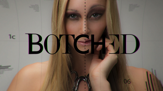
Creative agency creates a fresh, current and edgy show package for plastic surgery reality show.
Botched follows two plastic surgeons, Dr. Terry Dubrow (The Swan, Bridalplasty, Real Housewives of Orange County) and Dr. Paul Nassif (Dr. 90210, Real Housewives of Beverly Hills), as they attempt to fix cosmetic surgery disasters and counsel people who’ve become obsessed with having plastic surgeries.
Oishii Creative wanted to create an open that played to the subject matter of the show, so they decided to focus on the way media bombards its audience with the concept of an “ideal” body image. Using a mix of typography, messaging and imagery, the agency brought to life the chaos of visual imagery that viewers are immersed in every day. As a pop song declares, “Fix me, make me beautiful/I want to be perfect,” we see a stream of headshots and photoshoots as they are adjusted in Photoshop and marked up with a surgeon’s lines to indicate where every nip and tuck will go. The words “Perfection,” “Plastic,” “Body” and “Fail” flash across the images before revealing the show’s title.
“We wanted to explore what influences our perceptions of beauty and how we line-up with these illusions of idealized beauty,” says Ismael Obregon, Oishii’s President and Chief Creative Officer. “Through the graphics, we played with this line and explored the trust people place in those who attempt to enhance their images -- only to miss the mark.”
Instead of doing a literal translation of surgery, Obregon says he wanted the piece to rely on symbolism. “For example, hands mold the models’ bodies, moving and shifting their faces,” he says. “It’s an indication of how humans change other humans. And it’s also an allusion to our culture and the idea of peer pressure.”
The logo followed the same pattern of symbolism. By creating it out of different typography styles, and animating each of the fonts to re-emphasize the chaos of the letters coming together to form the logo, it’s similar to the show’s many surgeries.
The agency used stock imagery for the signage and billboard samples. For some of the faces and bodies featured in the open, they did a shoot at Oishii’s studio. The rest of the open was done in After Effects, Final Cut Pro, Photoshop and Illustrator.
Oishii previously worked with E! when it created the show open and graphics package for the channel’s “Pop Innovators” series. This past collaboration helped them make the larger brand connection between “Botched” and the network’s new identity.
“It’s really an avant-garde open, and an indication of where E! is going as a network,” says Obregon. “Having this understanding of their brand, from the color palette to visual terminology, really allowed us greater freedom to experiment with the design. We couldn’t have done this particular style of show open with any other client.”
Source: Oishii Creative


