Ryan Church tells Ellen Wolff all about the design challenges of working with George Lucas and Steven Spielberg on two of this summers hottest movies.
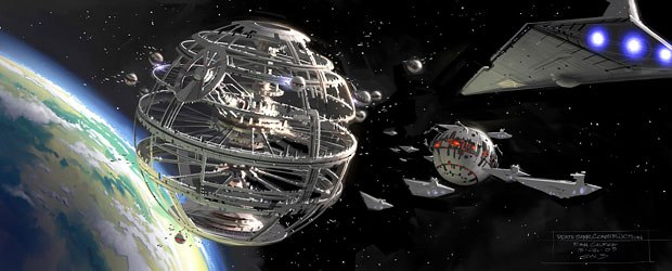
Concept designer Ryan Churchs work on Episode III required some 900 paintings and a couple of years of his life. All Star Wars: Episode III images © Lucasfilm Ltd. Digital work by ILM.
This has been a summer of unconventional war movies, and concept designer Ryan Church has been in the thick of the battles. Church co-supervised the concept art for George Lucas Star Wars: Episode III Revenge of the Sith, and he designed the towering Tripods for Steven Spielbergs War of the Worlds. The former required about 900 paintings and a couple of years of Churchs life, while the latter took four months, start to finish.
Church studied at Pasadenas acclaimed Art Center College of Design, and his industrial design training is evident in both films. His aesthetic is also on display in a series of instructive DVDs for The Gnomon Workshop. Six volumes of The Techniques of Ryan Church have been published through Gnomon and the Design Studio Press.
Ellen Wolff: Star Wars: Episode III opens with a massive battle involving a huge, intricate space cruiser. Did you design it in pieces, knowing that it would have to break apart into interesting debris?

Ryan Church.
Ryan Church: That was a big consideration in the design of the Separatist cruiser, which is General Grievous flagship. I wanted a different look for the space battle. I thought it would be good to set this battle really close to the surface of the planet. When battles are out in the black star fields, what you get which is completely legitimate is that when something is hit, it has this omni-directional, zero-G pop. I wanted to make it more like a World War II naval battle, where, when something gets hit, it lists and it trails smoke. Because were close to the planet, there is gravity and the fringes of the upper atmosphere are interacting with it. I just thought that would be a neat opportunity to give this battle a completely different look. So I did a bunch of paintings, which looked maybe a little bit too much like Victory at Sea. Those films have crazy, frenzied looks, with shrapnel flying they makeStar Wars look tame!
I was thinkingEpisode III, which is a galaxy-wide war, was a lot like WWII. If you look closely at the paint jobs on the big ships in this movie, theyre inspired by the camouflage that the Germans had on their ships. The Wookiee catamaran has got these black and white stripes on them like the Allied airplanes had. Some of those details are subliminal but we really wanted to tie that in.
EW: Since this movie brings the saga back to where the original Star Wars began, we see the old familiar Wookiees. But the stormtroopers look more diverse. Why are they sporting colors on their familiar white uniforms?
RC: George kept saying, These guys have been out fighting the war for the last three years, and theyve started to personalize their uniforms. He wanted to subliminally refer to what troops do they paint insignia markings on their crafts that refer to their squads. Its another WWII analogy.
EW: This film moves quickly from one planet to another from the Wookiees Polynesian-looking planet to a place full of hydra-styled plants. How did you develop visual identities for these places so that the audience would recognize where different events were happening?
RC: That was precisely the design challenge ofEpisode III. It was George saying, I need a bunch of planets that the Clone Wars happen on. He didnt say what the planets had to be. He just said, Make sure theyre as visually distinct from one another as possible in color, form, shape and technology. Were crosscutting and the audience needs to be instantly oriented.
That was pretty neat, because I thought we were going to do a morph between Episodes II and IV (the original Star Wars). But, in fact, George wanted to do all these different things. The use of wood on the Wookiees planet was a great example of that. I thought of it as a kind of high technology Frank Lloyd Wright. Wood is a high-tech material if you use it that way. I did a lot of research into laminated substances and stuff like that. I thought this could be a really unique aesthetic and still be in Star Wars.
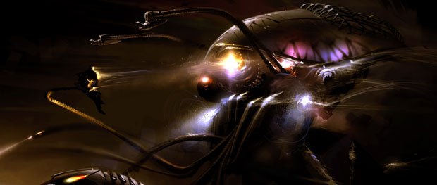
Churchs work on the Tripods for War of the Worlds was a four-month race to the finish. All War of the Worlds images & © 2005 Paramount Pictures and DreamWorks. All rights reserved. Images courtesy of ILM.
EW: The films shooting locations included Switzerland, Thailand and China. Did you look to those cultures for inspiration?
RC: The interesting thing was that they decided where to shoot based on our illustrations. For instance, the idea to set the Wookiees right next to water was something that I kind of came up with to differentiate them a bit from the Ewoks (the forest-dwellers in Return of the Jedi). We looked at Bali, Hawaii and China, which has these exotic limestone rock locations.
EW: Because of what was destined to happen to arch-villain Darth Vader, you knew youd have to depict some hellish environment.

One of the advantages of working with George Lucas is that he gives the design team a lot of time to experiment and explore new ideas. Above is Churchs concept art of the Alderaan Saucer Platform.
RC: Exactly. The planet Mustafar was going to be volcanoes, but to what extent? Ron Fricke, who had photographed Koyaanisqatsi, went to (Italys) Mt. Etna and shot a lot of footage, which was used as elements in the volcano battle toward the end of the movie. Mt. Etna was erupting and he shot some fantastic stuff. Its interesting to point out that technically, up until the last day before shooting, we never had a final script. And we only got a first copy of the script about six months into the project. Before that, it was George saying things like: Lets have a sinkhole planet that Obi-Wan visits.
EW: So you werent constrained by a script.
RC: Not at all. It was fantastic. We knew where the story was going, of course, but George really wanted to see what we had to offer. He loves working that way, whether ideas get in the movie or not.
EW: So George was willing to risk having concept artists going down some dead ends?
RC: We went down a lot of dead ends. But the one thing that George gave us was lots of time even though it never felt like a lot of time to explore and develop these different locations. He knew exactly what his story was; he just wanted to see how visually stunning we could make it. Ninety percent of what we designed got chucked out, and will be used in the future for other Lucasfilm properties. It goes on and on. Thats why working with George is such a pleasure. He loves the artwork. Hes the only guy that I know who puts his money where his mouth is. He has this huge air-conditioned vault where he stores all the artwork.

Because of the way ILMs pipeline is set up, Church had to account for every single asset in a shot. For example, he had to argue for things like laying a cable in a shot or painting in some grime. Kashyyyks Hologram Room by Church is seen
EW: How did you arrive at the design for Felucia, the planet with the hydra-like flowers?
RC: That was a late addition that I came up with. We had the crystal planet, the sinkhole planet, the asteroid planet, but George kept saying, Hey, theres still time if anybody has ideas for another planet. Im not done yet. I thought it would be cool to do a jungle planet, but what is really an alien jungle? Its not like Yodas earth swamp, but someplace where every flower and tree is designed and has a completely different evolutionary biology. But I wanted and I dont know where this came from something that would be really hard for ILM to do! Theyre always talking about their caustics and their bouncing light rays. So I designed plants on this planet to be gelatinous theres nothing like this on earth. Its almost like its the Gummy Bear planet. Its something I was especially proud of.
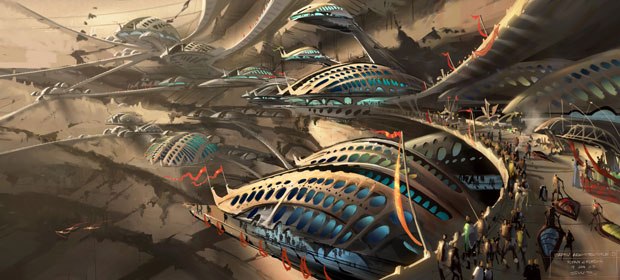
After working about a year to create the look of the movie, the conceptual art team was joined by the production designer and visual effects supervisors. Above is the planet Utapau.
EW: Another scene that appeared challenging for CG artists was when gelatinous shapes performed what looked like an otherworldly Cirque du Soleil routine. Where did that idea come from?
RC: The inspiration for that came on my birthday. My now-wife and I were going out to dinner and I got a call, which I rarely did, asking me develop ideas for a scene that George wanted to change. He wanted the scene to take place at a ballet or an opera. He said, Think about it being Swan Lake, or Squid Lake with squid guys. So I was thinking that we could do a space twist on a water ballet and have this giant ball of water in zero-gravity. So I sent these paintings over the next day and they ran with it.
Once the paintings got approved, George sent me to Vegas where they have the Cirque du Soleil show O. He sent me to take notes so we could really nail the final look. Again, it was something hard for ILM to do!
EW: It seems that this film has very complicated environments, with lots of life in the background.
RC: After reviewing Episodes I and II, it was my feeling that we needed to have a post-modern approach to our shots. The modern approach was to use technology to do a photorealistic shot virtually. Now the post-modern approach is to make it look like a photographic set, in that youre not just reproducing the ideal but also the clutter and the randomness of a real set. Oddly enough, when it looks more crowed, it feels more realistic. That was quite a battle with ILM, because the way their pipeline is set up, you have to account for every single asset thats in a shot. I found myself arguing for things like laying a cable in a shot or painting in some grime things that would have been so easy in the real world to do. That was the toughest job. But when George reacted favorably, people realized that there is a difference.

During production, Church switched between the roles of concept designer and art director. The Wookiee planet Kashyyyk is seen here.
EW: As the production moved along, what was the relationship between the production designer and the concept artists?
RC:
Since we were working 20 feet away from George, he shared ideas with us all the time. We basically had eight months to a year to work completely by ourselves to come up with the look of the movie. Then Gavin Bocquet, the production designer who Ive worked with before started coming into our meetings along with visual effects supervisors, John Knoll and Roger Guyett. They looked at the artwork that we created and had this kind of tug of war about which was the better or cheaper or more effective approach to each shot. Should we build this? We have x amount of square footage on the sound stage. That was the back-and-forth with them. If it was something tangible that they could build, that was one thing. But there are tons of things in the movie that defy a practical technique. They would decide the proportion of what would be built, and then Id work closely with the production designer. Id break things down, flushing out the details and translating the drawings in many cases via 3D blueprints. Then Gavins team would build it.
Those guys were in Australia, so during much of the building process I would go over to Georges house where he had this virtual link set up to have meetings in realtime. I would bring my drawings and they would bring theirs. George and Gavin and I were just sitting there talking as if we were all in the same room.
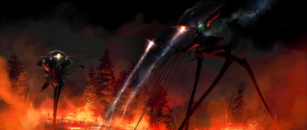
Churchs work on General Grievous bike led to his being asked to design the Tripods for War of the Worlds.
EW: Youve remarked in the past that once production gets underway, your job shifts to becoming more of an art director. Was that the case with this film?
RC: Definitely, though it was completely non-linear. Near the end of the production, when George would come up with an idea for a new sequence, Id have to become a concept artist again. But for the most part, I would work with John Knoll and Roger Guyett at ILM. Id go to matte painting dailies and model shop dailies and walk around and look over the shoulders of the modelers. It was a solid year-and-a-half of being in the trenches at ILM and art directing those guys. I originally had started working for George at ILM, so it was a homecoming for me.
EW: One of the big animation challenges of this film was the all-CG villain General Grievous. Did George give you specific directions about him?
RC: He said two words: Droid General. We asked, Could it be a robot? Yup. Could it be a creature? Yup. It can be anything you want. So everyone in the art department did passes on it. Dozens of drawings were done the first week, with no real positive reaction from George. So everybody went back to the drawing board. Then (concept artist) Warren Fu did the design that was 99% of what Grievous became...
EW: Grievous wears a cape thats a key part of his style. Do you get involved in things like cloth design?
RC: We get involved in every last little thing. We do all we can to give that level of art direction to ILM, because they want to hit the ground rolling and do the shot. In fact, one of our artists, Alex Jaeger, was responsible for different variations of the cloaks that Grievous and his bodyguards wear. He went out and got fabric samples of the heavy muslin of the bodyguards capes, and the quilted silk of Grievous cape. It was Warrens masterstroke to put capes on Grievous and his bodyguards. And ILM now does cloth so well.
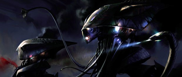
Church did very detailed breakdowns of how the Tripods worked. He worked closely with the Skywalker Ranch animatics teams to make sure that all the creatures capabilities were fully utilized.
EW: How did you come up with Grievous transformer-like bike?
RC: George said that Grievous needed something that could move like a lizard, meaning that it could climb up walls and go really fast on the straight-aways. But it had to be mechanical. That was a really tough design challenge. I came up with something that could fold its legs and become a moving chain-saw wheel. Then it could shoot the legs out and climb like a lizard. When Steven Spielberg came by during Episode III and saw General Grievous bike, he said to George, Thats the coolest thing you ever designed. A year later, (Lucasfilm producer) Rick McCallum got a call from Steven. He said, I want the guy who designed that bike thing to design the tripods for War of the Worlds.
EW: War of the Worlds was made on an extremely tight schedule. Did any time pressures affect your process of designing the Tripods?
RC: That was a fish to fry. The design for the Tripods was chosen fairly early on and then there was a lot of refining to make it work. Unlike Star Wars, where we had a million different things, this was one hero thing that youre looking at from different angles though were looking up at them a lot because theyre so tall. It was a really cool design challenge to make them look scary the whole time.
Im a huge fan of the original movie and especially the book, so I kind of knew what had been done and what Steven wanted. In addition to looking scary, they had to have performance capabilities. He kept referring to them as ballet dancers, which was really interesting. Steven ended up kluging a couple of my designs together. From there I worked with the animatics team at Skywalker Ranch, and then with the modelers at ILM.
I did very detailed breakdowns of how these machines worked. Id built all these little capabilities into the Tripod, and I wanted to make sure that they were utilized. When the animatics guys were performing with it, I was looking over their shoulders and saying, Did you know that the mouth parts can fold out and make a more predatory silhouette, and then they can recede? It was great to work with those guys because they were actually doing the first pass on the movie. Then Steven shot it and ILM did the effectsOnEpisode III, time was a luxury, butWar of the Worlds was the quickest Ive ever worked.
EW: What tools did you use?
RC: Lots of (Corel) Painter and napkins and pens. Every painting I did was on Painter. On Episode III, I used Painter 6, though Ive since switched to Painter 9.
EW: Do you use it to emulate oils vs. acrylics, for example, to suggest different moods?
RC: Occasionally, where appropriate. If its more of an illustration job, where I have to put this ship in that environment, I will approach things differently than if I have a blank sheet of paper. What Painter has allowed me to do which you cant do in the real world is start off oil painting and then switch to acrylic. Having used it so much, the stuff I do in Painter is exactly what I want it to look like. When youre doing a watercolor or an oil painting, theres always a compromise, but with this there is no compromise. There are no excuses anymore. If something can be depicted in two dimensions, you can do it with these programs.
EW: What are you working on now?
RC: I probably cant say, except that Im working in L.A. on several pitch projects for big science-fiction movies that have yet to be green lit. Its work to basically sell ideas to the studios. Im still employed by ILM, but only technically.
EW: So pitch meetings with studios arent something youre used to.
RC: No, not at all. It is a little bit of a shock after working for George for the last seven years, counting my time at ILM. The guy snaps his fingers and it gets done. It was just a matter of pleasing him. I feel so fortunate to have had that experience and now I feel prepared to walk into anything. I know whats important about design ideas. Im confident in the work and its either appropriate or not. Presenting it is just not a problem anymore.
Just like when Ralph McQuarrie did those paintings for the first Star Wars, it is the pitch art that gets people excited. There was no such thing as an Art Of book before Joe Johnston and Ralph McQuarrie. Its how George got the first movie sold.
EW: Youve had a long collaboration with your fellow design co-supervisor, Erik Tiemens. Can you envision working with him in the future?
RC: Ive moved down to L.A., and Erik is still up at ILM and I dont think hell move. Im originally from L.A. and my trip to northern California was kind of a detour that was supposed to be about six months on a freelance gig. But were already working on the same projects and if they get green lit that relationship will get bigger. I would love to continue my relationship with ILM. They do the best work and I know how things operate there.
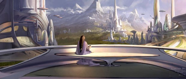
Churchs tools on Episode III included Corel Painter 6 and napkins and pens. A view of an Alderaan balcony is seen above.
EW: Do you have aspirations to become a director yourself someday?
RC: Of course. Thats the long-term plan. But right now its just cool to be able to draw stuff and show it to people on its own merit, vs. it having to take it to film. Thats what I enjoy most. I do like working with really talented directors who push me further. I find that I work a lot harder and come up with better ideas when I have limitations, and when I have somebody I really want to please. If you can impress George Lucas and Steven Spielberg, thats as rewarding as it gets.
Ellen Wolff is a southern California-based writer whose articles have appeared in publications such as Daily Variety, Millimeter, Animation Magazine, Video Systems and the website CreativePlanet.com. Her areas of special interest are computer animation and digital visual effects.


