Taking visual cues from Gustav Dore and other classical artists, the look of Shrek 2 has more detail, richness and lighting bounce than its blockbuster predecessor, as evidenced by this exclusive visual development gallery.
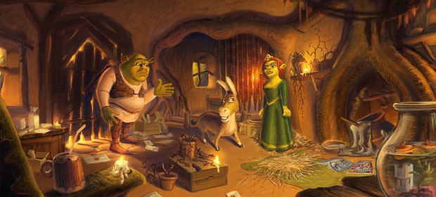
Those green ogres may be ugly but not the production design, as you can see in this visual development gallery for DreamWorks Shrek 2 (opening May 19). They clearly strived for greater detail and richness in creating the visual look of the sequel. Taking inspiration from Gustav Dore, the renowned 19th century French illustrator and engraver as well as the classic Disney animated fairy tales that he inspired, production designer Guillaume Aretos and his colleagues improve the lighting to help us better experience the pop cultural cornucopia that underlies the Shrek environment. Overall they used a lot more displacement and global illumination in obtaining a greater realistic bounce light.
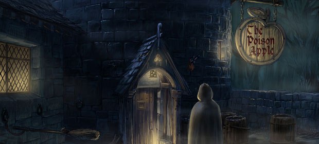
Shrek 2 is a lot darker because theres a lot more happening at night, Aretos explains. There are a lot of medieval paintings and illustrations that we used quite a bit also. Other than that there are my own influences, which are classical paintings from the 15th and 16th centuries, but those are not as direct. In fact, nothing was absolutely direct. The design of Shrek is always a twist on reality anyway, so we tried to [pack] as much detail and interest as we could in the imagery.

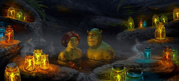
Fiona and Shrek enjoy a muddy honeymoon. Visual development design by Huy Nguyen. All images courtesy of DreamWorks Pictures.


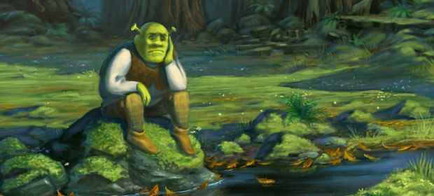
Shrek contemplates by a stream before being attacked by Puss n Boots. Visual development design by Shannon Jeffries.


