Canadian children’s network gets a smart, playful look inspired by imagination.
 LOS ANGELES -- Creative production studio Roger has rebranded the new Canadian preschool network Family Jr., part of DHX Television’s suite of channels. The realigned network and its French-language counterpart, Télémagino, are geared towards children age’s two to five.
Working closely with Family Jr.’s in-house creative team, Roger, led by Creative Director Rich Scurry, developed a comprehensive on-air brand strategy and look for the network, including a custom logo, story-driven promos and station IDs.
“Roger’s interpretation of the Family Jr. and Télémagino brands, which are all about encouraging active imaginations amongst our young viewers, reflects what we aspired to capture in launching this new brand and look, the wonder and creativity of young minds, as well as a world to which both kids and parents are instinctively drawn,” remarks DHX Television Creative Director Jason Gordon, “The collaboration with their creative team was exceptionally smooth, as usual, and Rich not only brought incredible concepts and design chops as a creative director, but also invaluable insight as a parent of a preschooler himself.”
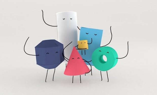
The new Family Jr. graphics package is highlighted by a cast of geometric, paper-textured characters that that come to life to tell engaging micro stories. Behind a team of animation talent with extensive character design and children’s entertainment experience, including film credits for Toy Story, Shrek, Alvin and The Chipmunks and Peanuts, Roger combined stop motion-like techniques and 3D designs with hand-drawn character limbs and eyes to create photorealistic characters that were distinct to Family Jr.
From the outset, Roger and the network creatives emphasized making the Family Jr. brand tactile, simple, playful and smart. Paper, a time-honored kid’s art medium for drawing, coloring, cutting and pasting, was the obvious choice for conveying tactility through various textures across the package. A clean, modern design and color palette reinforces simplicity, which was integral to making the content digestible for kids. This idea was also reflected in the playful sensibility of the brand, from a loose animation style to the handmade custom typography. In addition, Roger developed sophisticated, narrative-driven branding concepts in order for Family Jr. to equally resonate with parents and caregivers, the viewing decision-makers.
“The team at Family Jr. embraced forward-thinking, ambitious ideas while never once shying away from pushing the creative and exploring new solutions,” says Josh Libitsky, Executive Producer at Roger. “They were supportive of our team throughout, making the collaboration effortless and enjoyable.”
Roger created two custom typefaces for Family Jr., a handwritten font and a modern sans serif font. Both are clean, bold and geometric-inspired; the hand-drawn font has a pencil grain aesthetic, while the sans serif appears to be a paper cutout. Like the characters in the station IDs, the new network logos, for both Family JR and Télémagino, are created from primitively designed geometric shapes, which are playfully stacked together like building blocks.
“Family Jr. was exceptionally cognizant of their audience going into this rebrand,” comments Scurry. “Although they can’t yet read, these young viewers are still receptive to letters and basic shapes, so we made the logos intuitively and visually relatable to them. We also spent a great deal of time making what were complex animations intentionally unrefined.”
According to Roger, the on-air branding package will be used as inspiration for Family Jr.’s print and digital elements.
“We weren’t just trying to put a skin on the network,” concludes Scurry. “We wanted to craft a voice that could embody the spirit of the network, live on any platform, and provide a foundation for Family Jr. to grow.”


