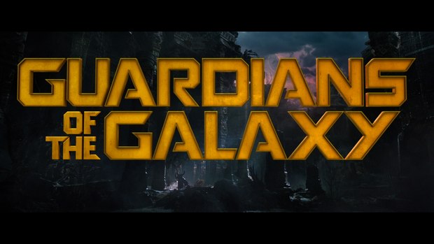
Custom typography featured in now-famous title sequence animated using Adobe After Effects, Autodesk Maya, The Foundry's Nuke, and Tweak RV.
 CHICAGO -- The top U.S. box office film of 2014, Marvel Studios' blockbuster Guardians of the Galaxy launched on digital platforms on November 18 and became available on DVD and Blu-ray on December 9. While the designers, animators and producers of Sarofsky Corp. are accustomed to seizing big-screen and television spotlights with their masterful main title projects, the group's contributions to Guardians required a different type of artistic and production expertise.
Earlier this year, Sarofsky Corp.'s two-minute, full-screen, fully animated main-on-end titles for Captain America: The Winter Soldier drew rave reviews from all around the world. In contrast, Guardians director James Gunn envisioned his movie's titles appearing at the beginning of the movie over picture that he filmed. In Gunn's now-famous title sequence, Star-Lord (played by Chris Pratt) cues up “Come and Get Your Love” by Redbone on his classic Sony Walkman, then dances his way through a foreboding alien landscape as the film's title and main credits animate on and off the screen.
For its work on Guardians of the Galaxy, the Sarofsky team animated the main titles using a custom typeface designed in-house. The custom typeface was also employed in location cards used throughout the film.
“We always look at projects to see how our talents can best be utilized, and in this case, it was about us showing restraint and precision,” explained company president and owner Erin Sarofsky. “At its core, this was a typography assignment. Essentially, we set out to create typographic elements that are legible and cool-looking, but not overly emphasized…most important was that they had to work into the plates seamlessly and not take away from Star-Lord's performance.”
The project's major challenge had to do with the fact that the Star-Lord scene underwent many revisions at the hands of the editors, so placement and timing of names had to change as well. “Also, their cut starts out kind of slow and methodical then, half-way through, ramps up when Star-Lord puts on his headphones and the music livens things up,” Erin added. “To play against that with the animation, we start the first half with simple fades as the names come on screen. When the music kicks in, the typography begins to really animate on and off in a more fun way.”
Delivering the files in the correct color space, accurately viewing the large resolution stereoscopic files, and managing the project within new comp iterations from Marvel's vendors throughout production also tested Sarofsky's team. “The main tools used to combat potential issues on these fronts were communication and planning,” Erin said. “No software package is going to fix the failures of a poor pipeline.”
With the project's focus on 2D type animation, Adobe After Effects was selected as the primary animation/design tool, along with Autodesk Maya, The Foundry's Nuke and Tweak RV. After setting up templates in After Effects, artists designed and animated in correct color and resolution. To address the changes in the background plates, type animations were output with alpha channels, which allowed the typography to be repositioned or re-converged later on in the pipeline. All the AE renders were then conformed in Autodesk Smoke.
“We use Smoke heavily on all our Marvel work, as it's one of the few tools that can play down large resolution stereoscopic files in real-time while applying a Look-Up Table,” Erin said.
Source: Sarofsky Corp.


